

Mastering Dimensioning Rules for Architectural Lettering and Graphical Drawings
- Dennis Asis
- Jan 18
- 2 min read


Clear and precise dimensioning is essential in architectural drawings. It ensures that builders, engineers, and clients understand the design intent without confusion. Mastering the rules for architectural lettering and dimensioning helps maintain consistency and professionalism in graphical working drawings. This post explores key dimensioning rules, lettering standards, and proportion conventions that every architect and drafter should know.
Understanding Dimensioning Rules in Architecture
Dimensioning rules guide how measurements are presented on architectural drawings. These rules prevent clutter and misinterpretation by organizing information logically and clearly.
Placement of Dimensions
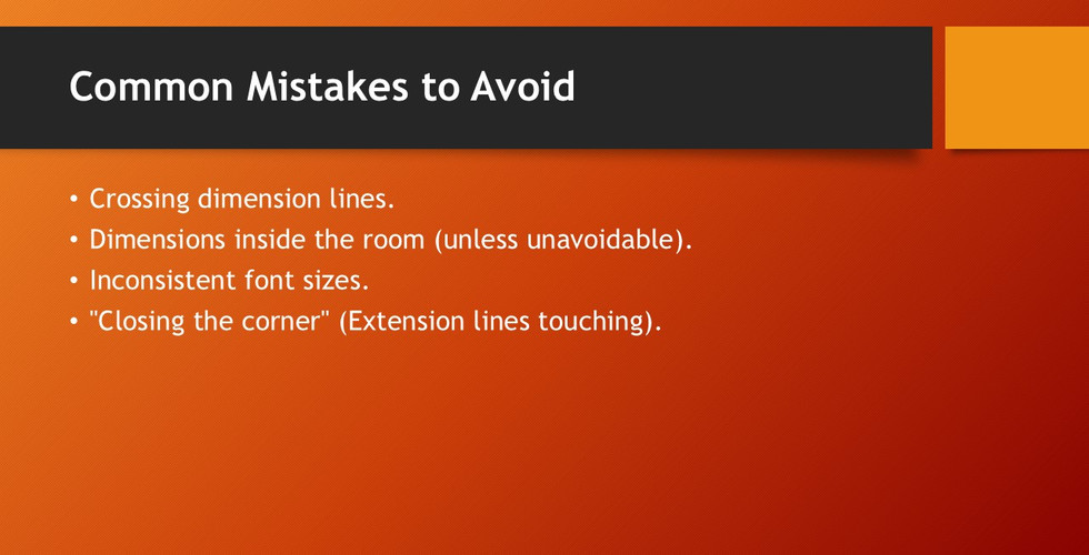
Dimensions should be placed outside the drawing whenever possible. This keeps the drawing clean and easy to read. For example, avoid placing dimensions inside the floor plan where they can overlap with other lines or symbols.
Use of Extension and Dimension Lines
Extension lines extend from the object to the dimension line but do not touch the object’s outline. Dimension lines run parallel to the measured feature and end with arrowheads or tick marks. The spacing between these lines should be consistent, usually around 6 mm apart, to avoid confusion.
Avoiding Redundancy
Do not repeat dimensions unnecessarily. For instance, if the overall length of a wall is given, avoid dimensioning each segment unless it is critical for construction.

Architectural Lettering Standards
Lettering in architectural drawings must be legible and uniform. It communicates important information such as dimensions, notes, and labels.
Font Style and Size
Use simple, sans-serif fonts or traditional architectural lettering styles. The standard height for lettering is typically 3.5 mm for general notes and 5 mm for titles or headings. This size ensures readability when printed at full scale.
Capital Letters
Architectural lettering usually employs uppercase letters only. This improves clarity and reduces the chance of misreading.
Spacing and Alignment
Maintain consistent spacing between letters and words. Letters should be aligned horizontally and vertically to create a neat appearance. For example, dimension numbers should be centered above or within the dimension lines.

Proportion Conventions for Graphical Working Drawings. Dimensioning Rules for Architectural Lettering and Graphical Drawings
Proportion conventions help maintain balance and clarity in drawings, making them easier to interpret.
Line Weights and Types
Use different line weights to distinguish between elements. Thick lines represent walls or structural components, medium lines for fixtures, and thin lines for dimension lines and hatching. Dashed lines often indicate hidden features or elements above the cut plane.

Scale and Size Relationships
Drawings should be scaled appropriately to fit the sheet size while maintaining legibility. Common scales include 1:50 for floor plans and 1:20 for details. Lettering and dimension sizes should adjust accordingly to remain readable.
Consistent Symbols and Notations
Use standardized symbols for doors, windows, and other elements. Consistency in symbols and dimensioning style helps avoid confusion across different drawings in a set.
Head over to our Resource Section for more insights and useful references.